Button Graphic Design

banner project 1

For Pixel Based Imaging we had to create a design for a download button like those that they use in websites. We started off with a simple rectangle and added a line in the middle. We used two different shades of the same color and filled it in. Then we used the gradient tool with a white color on one side and transparent on the other to make that ”light” effect on the top of the button. Then we used a darker color for the lineart of the button. What followed was to make the text saying ”Download eBook” and shaded them under to make them pop out a bit. After adding the small icon image of a PDF  file our icon was done!


-Eri

wall exercsi.png

In one of our first lessons we were asked to make a simple wall texture to be used for a 3D wall model. We were given some simple stock resources such as moss, dirt, broken wall pieces and dripping paint and we had to put them all together to create one piece. We were free to add anything else we wanted to it so i took the chance and added a small gas mask graffiti and some more dripping paint. Using the Hue, the Saturation and the color levels as well as the opacity of some layers we were free to make the wall however we wanted and imagined it to be. I added some moss on the top, some dripping pain on the bottom and some broken wall pieces on the top right and bottom left of the wall. And thats pretty much it!


-Eri

Logo Design

logo project 1


Our next portfolio project was to make a logo for a company. In this project we had to use a lot of Symmetry so nothing was looking out of place. Using colors and color lines to make everything look neat, we worked with stamps and grid lines too. To make the big M in the center of the red box, we had to first create the red box and then slowly started making the outline of the M with white lines. After making sure with the grid that everything was calculated and placed correctly we used the bucket to fill it in with a white color. So thats pretty much it! Making everything simple and tidy is the easiest way to make a company logo!


-Eri

First Aid Kit

Texture tutorial

One project we had to work on was to make the texture of a First Aid Kit used as a texture for a video game model. Starting with a plain background we started adding shapes such as the two tubes,the circle, the grey lines, the cross and the grey box. After that we added new layers with textures and different colors and clipped each one of them on the shapes so they will have different colors and textures between each other. After adding the letters with their own texture on we used some shadowing to make some things pop out or pop in to give them different attributes. At the end we used the same texture over everything to make the whole thing look kinda the same so nothing will be out of place.


And that pretty much it!


-Eri

Popart project

So today in class we tried our hand on a classic Pop Art style~


Starting from an actual photo of a person we slowly started learning about new filters and techniques that will affect the distortion of the image from a realistic style to a kinda cartoony style. After turning the image to monochrome and cutting off the actual background we started adding color with the brush tool to bring back the skin, lip and eyes color. Using some different filters to make the lines change shape a but, we added a light shading at the edges to make them smoother so they wouldnt pop out too much from the background.


So thats pretty much it! Learning how to make an actual image into a classic pop art styled image was pretty fun and easy to make!

Evaluation of assessment 1 (pixel based imaging)

Assignement 1

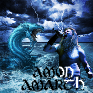
On the 11th of November we had an assessment for our pixel based imaging class which included a 200 words essay with the title ”copyright: can i use the work of others” and to make from scratch an album cover for a music band.

As expected from me i tried to make an Amon Amarth Album cover that i was kinda satisfied with but not that much. For everyone one of the elements on the image i did use a different layer as i am used to do so from drawing, and just to keep things neat and clean. I did use a lot of different tools, such as the stamp tool for the sea under the sea monster and the person to make them blend in with the sea on the background, the hue, saturation and lightness tool to make the colours blend better, the magic wand tool and quick selection tool and a lot more.

Even tho i was quite happy with the outcome of this image there are some points that i could have done better or maybe spend more time on. Fix them a bit maybe or used a different technique to make it look better. One of these things is the colour and saturation of the lead singer on the right. The positioning, him looking at the sea monster is what i really like. But the fact that i tried to blend him in with the blue hues of the picture didnt really work out as i wanted it to do so. I tried making another blue coloured layer above it and clipping it together, then changing its attribute to overlay, it worked a bit but not as good as i imagined. I tried to play around with the opacity, hue and saturation to see which blue would fit best but this is the nearest i could get to the background. Other than that im pretty happy with the result. I could have used other techniques too but i was too afraid to do so because having more stuff on the image will have made it too packed with stuff. The lightnings and detailed waves being there already, i felt like if i tried to add more things in there that i would have been too much. After all that just to change its feeling a bit i added a textured layer above all and changed its attribute to overlay to tone the feeling up a bit. And thats it!

I could have used more things, might look a bit  ”plain” but thats my idea of what an album cover for amon amarth would look like. Maybe play around a bit more with the tools or try out new ones that i havent looked at before. Ill keep that in mind for the next assessment and maybe some of the feedback to work out a better result.